Article #15- How to Identify Balance in A Painting
Do you ever feel out of balance? When you walk around your home do you feel that something is just not quite right? Color in the art can be the problem or the solution.
The following artistic tips can be used in many ways. They can assist in decorating a home, planting a garden, or plating a fine meal. It seems to me that understanding design and balance assists in feeling better about life in general. Art touches our lives in so many ways. For me, painting fine art is a lifeline that flows through to happiness.
Color Harmony
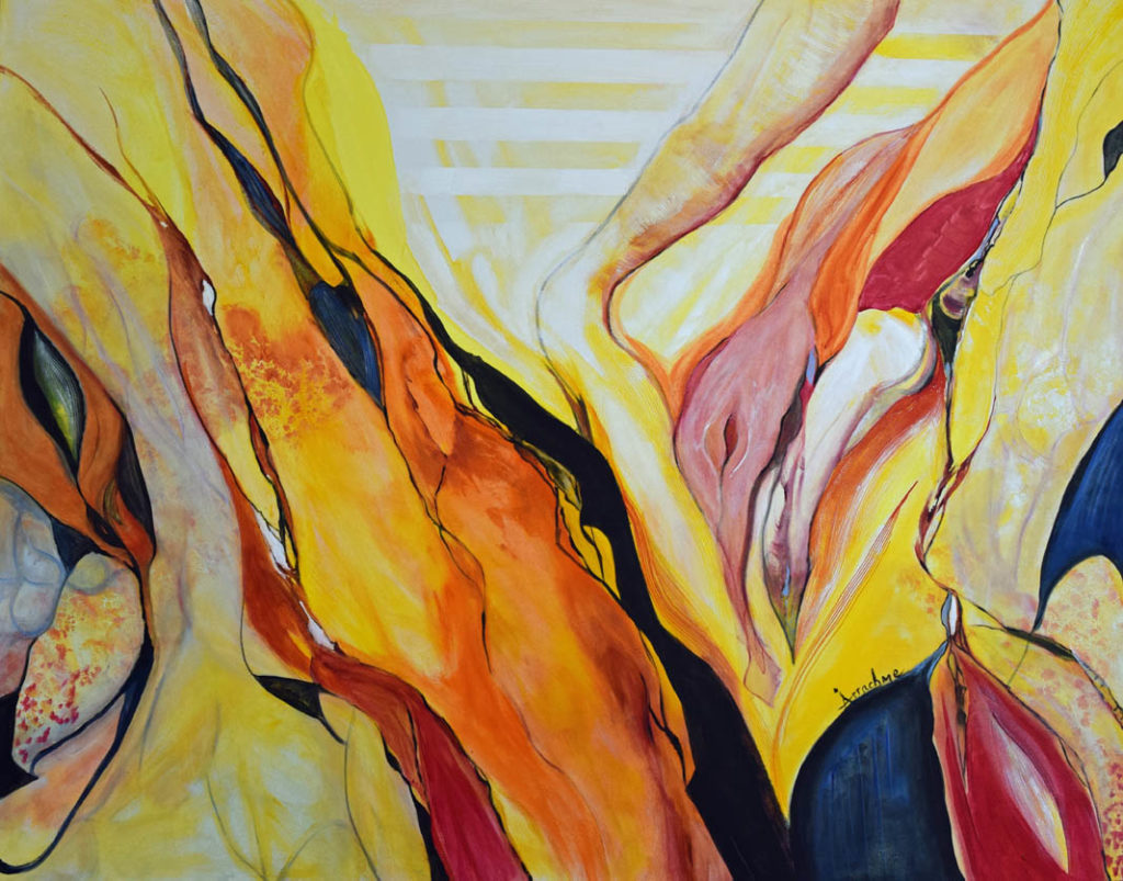
In the included painting, “Impenetrable,” we get a sense of balance, but why? I resourced a few design concepts that created a powerful impact on this very large canvas. Two of the elements are value and shape. Color harmony can make or break a painting. You may be familiar with the expressions, warm colors, and cool colors. I prioritized the warm family of yellows, reds, and oranges. Their variations emerged by mixing these analogous colors which created a built-in harmony. Their methodical placement in the painting developed a rhythm for the viewer to feel an instinctual positive flow. However, the choice of the warm bright color family, alone could not complete the painting. Color choice is like a family or group of friends. You always must have different personalities to glide along cohesively. The faction may have similar well-blended likes and dislikes but without a present well-balanced contrast, the group would implode or just wither away as uninteresting. The same goes for an exceptional, unique painting. It needs to have contrast.
Knowing this I created the balance easily in this painting by moving to the opposite side of the color wheel where I found the opposite of warm. I mixed deep cool blue, and black, with a touch of red for a perfect dark on the palette. Remember the touch of a deep red was important as an inclusive salute to the original family of warms. Never forget the founders.
Placement
Identifying the right color is one thing, but where was the correct place to add the color and not interrupt the flow that was already engaged. The easy answer is to position the darkest darks directly beside the lightest lights. You can try this when you have your next dinner party. Try using contrast to set the table. Step outside and look at your garden. Are you missing contrast? Or do you have too much contrast?
It is easy to see that using original unique fine art paintings in a home can create a much-needed instant impact to generate a positive feeling. They can also be the cornerstone to build a well-balanced color palette. They speak out loud as to who lives in the home, and their point of view. The shapes and images speak for individuals. We have all visited a museum and walked by many paintings. We don’t stop at all of them. The ones that stand out have balance. An abstract painting might say, “Hey, look at me. A seascape painting might say, do you remember when we had that great time?” No two people are the same. Now you are ready to move forward with the focus on balance using contrast.