What Colors Are Best In Paintings? #6
The Art Lady – As Seen in Villager Magazine-Oct 2021 by Arrachme
If you have not studied color, just knowing how color can affect your moods, can be helpful in the decision-making process of collecting fine art. We can Identify color as having been helpful in a variety of applications. Artists naturally build a limited color palette of favorites that form their foundation, which plays a significant role in the artist’s signature style or brand. Advertisers developed uses of color in subtle ways to gently move people emotionally to buy one product over another.
What about Red?
Let us take the color red. It is received in the west as an upbeat color that stimulates heart rate, brain activity appetite, and passion. The opposite color on the color wheel is green. Why is it important to know this? When opposite colors are placed next to each other, they complement each other. In other words, they cancel the effects of each other or balance each other. I am not talking about mixing opposite colors, rather placing them next to each other.
You can find examples of color used throughout history. The manufacturer of Coca-Cola and fast-food restaurants use the color red. Why? A consistent turnover is important in fast-food eateries. Red needed to encourage guests to buy their food, eat, and move along. Red also increases passion. Therefore, we traditionally give red hearts and roses on Valentine’s Day. Knut Rockne, the Notre Dame coach, had to have been aware of color application. He was said to take the team into a room painted red just before the game to activate the player’s nervous systems which encouraged a win on the field. When red was the dominant color for lipstick, the manufactures would paint the inside walls of factories green to counterbalance the employees’ daily experience. Have you asked why surgeons scrubs have always been green? The green clothing would balance the red color that the surgeon would have to look at for hours while operating. They found that if this balance were not created, the surgeons, just like the lipstick workers would step away from the table seeing spots and in cases even feel lightheaded.
It has been proven that color can affect how some people physically feel. Some more than others based on sensitivity.
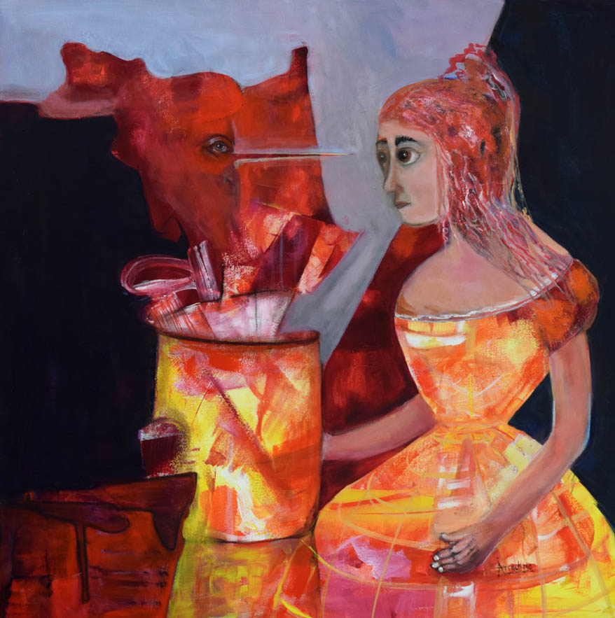
See my accompanying painting “Beguiled” which was awarded to represent the USA in the art exhibition in Anatolia, 2021, You and Me Under the Rainbow. Beguiled has large amounts of red and the red family. It is meant to be a strong conversation piece. It captivates the viewer for more than a split second. If the cool grey-blue and dark notes were not present the painting would push the viewer away instead of drawing them in. This painting resulted in art that touches people emotionally pushing the reaction to be comfortable or not comfortable. The quantity of red was carefully chosen.
Compare the use of red around the world. It has had quite different uses. Red has been a popular color in the Far East for weddings. The reason is that red has been an indicator of happiness, joyfulness, and good fortune, hence the perfect choice for well-wishing during specific occasions. However, in the Middle East red can mean danger and caution.
Variations of Blue
Blue is the color of water and the sky. In the Far East, it means feminine, healing, and restoration. In the West, it evokes a sense of quiet trust and calm. It slows the heart rate. Others have used it to indicate sadness or depression. Picasso used his knowledge of color when he exclusively painted blue during a chapter of his life that is called his “blue period”. It reflected a somber frame after he lost his dear friend, Carles Casagemas.
This may have sparked a thought in you. When you traveled in the past, what colors did you pack in your suitcase?
What Colors Are You Drawn To?
If you find yourself being drawn to a specific color, it might have something to do with how you are feeling. Has your favorite color changed over your lifetime? What were you doing when, orange, blue, purple, or yellow were the colors that stood out for you? What region of the world were you living in when you collected those colors?
The old master painters were told what colors to use when commissioned to paint mainly because the religion of the times dictated how they wanted certain people as historical figures to appear. It was a critical time where color was used as an important visual language. The term blue blood referred to aristocracy, nobles, or wealth in the English 19th century, but there are indications that the term stretches further back to the medieval Castile families of Spain. Putting status and power aside, the term referenced pale skin where you could see the bluish veins peering through their bodily extremities. I am not sure why the non-noble families were not mentioned or what their veins looked like. One could only guess that they did not bathe often, so you could not see the skin.
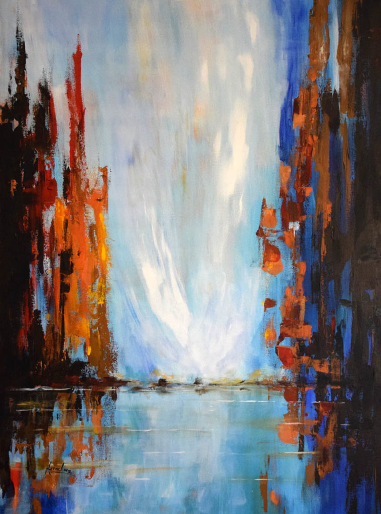
For me, there has always been much care that went into choosing the specific painting from my inventory that I sent to exhibits, galleries, and museums around the world. Regardless of the meaning of image content, color specifically has played a significant role. The example of contrasting color that I am including in this article is my painting “City of Light 1-5”. It is part of a slight variation in a series of original paintings that are predominately done in blues. You can get a close-up view in our village neighborhood; an original can be seen in the local Wolfgang Puck Restaurant. The other originals reside in the neighbor’s homes that collect my work. The gentle feeling, as well as the crisp pops of blue, was created by the amount of the complementary colors used. Even though the paintings may seem simple, the color palette has been carefully planned out regarding the percentage of each color applied. If this had not been done, the paintings would have never reached their current level of success.
You now possess some fun information about color.